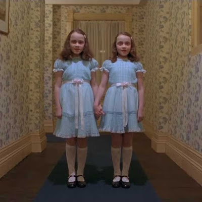
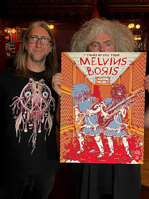
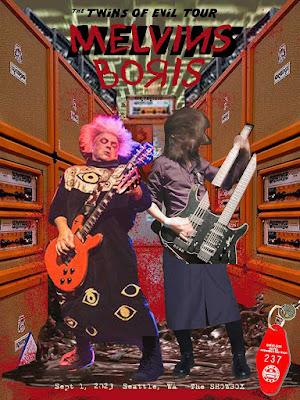
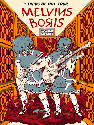
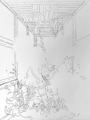
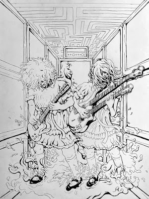
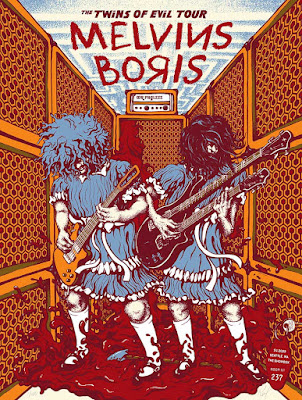
TWINNING! Some very late nights toiling away alone in the studio had me tapping into my inner Jack Torrance, whilst going full King/Kubrick on the art for these here 4-color silkscreen posters. Within this bloody hallway of Orange amps are plenty of juicy little nuggets drawn from the film and bands. I'm hoping I did the king of horror, the cinematic master, and of course the bands justice! Buzz and Takeshi make a great pair of Grady twins, don't ya think?
These will be available from the bands directly at their Seattle show at The Showbox, this Friday, September 1st. Afterward, I'll be posting them up for purchase in my shop on Sept 2nd at 11am (PST). Feel free to hop on my mailing list if you'd like an early heads up.
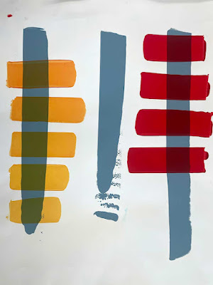
In addition to the standard show posters, I'll have a handful of the below winter-inspired 'SHINE' variants, all of which I will be custom-etching one by one with individual doodles throughout, exposing the shiny rainbow foil innards that lie beneath.
THE BACKSTORY
With the 'Twins of Evil' tour name, I just kept thinking of the infamous Grady twins from Stanley Kubrick's cinematic masterpiece of horror, The Shining. Their fate was not so good, but not the fate of these sludgy beasts...even in dresses. While brainstorming how I wanted to approach this project, I was bouncing around concepts of polar opposites, dualities of the mind, double-sided objects (coins, playing cards, etc), and even the Hammer film of the same name, but just kept on coming back to The Shining.
I love the film so much, but since there is so much fan art out there already, it just seemed a little too perfect. I was convinced someone else MUST have already done this. Of course what ever I made would be unique to my style of art making, but still I wouldn't want to replicate anyone else's idea, even accidentally. So I dug around all over the interwebs and couldn't find any Shining-infused band posters, art or albums. Just in case, I also made sure no other artists were currently working on anything close to this idea for this tour.
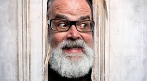
As my paranoia had me digging around, I stumbled across this portrait of the one and only Frank Kozik–legendary poster and pop art icon, who was massively influential in the Melvins' art since their beginning. Kozik sadly passed away earlier this year and though I unfortunately did not get the chance to know Frank, friends' stories are vast and reverent. In some small way, I felt like stumbling across this image was him saying, "Heeeeeere's Kozik! I see what you're trying to do there kid, just run with it and stop overthinking it."
I knew I wanted Buzz to be one of the 'twins' because I wanted to draw that iconic mop o'hair in action. For Boris it was tough to choose to be the other 'twin girl', but in the end went with Takeshi because I wanted to draw his signature custom bass/guitar because that thing is just badass. And voila, we have our twins shredding away on their specific 'axes' within a lovely hallway of bloody doom. Speaking of axes, the notorious axe that led to the sad demise of the Grady's and would end up in the hands of ol' Jack, lay at their feet.
The hallway walls are made of Orange amplifiers, which are intrinsic to Boris' sound. I replaced the mesh of the amps with the same iconic carpet pattern that guided little Danny boy in his tricycle to the twins and featured throughout the film. In fact the carpet pattern is what inspired my entire color scheme for the poster, which worked well with the orange of Boris' heavy use of Orange amps and Buzz's (older) orange Les Paul. The rear amps are unleashing a deluge of blood, a la the elevator scene. Off to the side, hanging from an out of frame doorknob, is the key for room 237, which kindly lists the show info as well.
The lettering of tour name font harkens back to the film's title treatment and the band names are of course scrawled in the fashion of Danny's lipstick warning to his mother about the fury of insanity headed their direction. The Mr.Phylzzz name replaces the lettering of the Orange head logo.
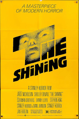
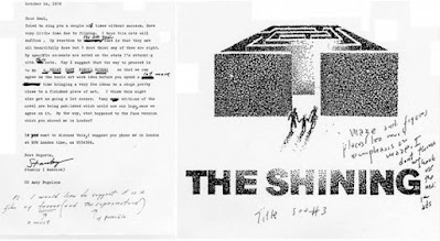
Behind the band names is an inverted image of the Overlook Hotel's hedge maze, The lighting and stipple and technique are a nod to the original film poster art by legendary designer Saul Bass who worked on everything from The Shining, to Hitchcock titles, to the Girl Scouts logo, Geffen Records, Kleenex, and so much more. There is this great page I found showing his rejected sketches with notes from ol' Stanley–most of which included mazes.
I'd visited the Stanley Hotel (King's inspiration) near Estes Park, Colorado a couple times, but it was my friend Leon who informed me that though he didn't know too much of the film, he knew it used the phrase, "all work and no play makes Jack a dull boy" from one of his favorite books, Kerouac's Big Sur. Jack Kerouac had taken a reclusive job, through the Parks Service I believe, to be an onsite 'caretaker' in Big Sur. This was toward the end of his life and thus in the thralls of his alcoholism and road to destruction. Somehow I had never heard of this link between Kerouac to King, but it kind of blew my mind. I've since borrowed his book and will begin reading it once I'm done typing this nonsense.
Most-importantly, I'd like to wish the best drummer in the world, Mr. Dale Crover all the best in his recovery after he undergoes emergency spinal surgery. Though he is irreplaceable, Coady Willis is as close as it gets. I got to see the show recently here in San Francisco and Coady absolutely crushed and of course Buzz and Steven brought it as always for the Melvins! If you're going to a show on this tour, do not sleep on the opening act, Mr.Phylzzz, who blew me away with their unique form of quirky intensity and erratic "ugly Chicago noise rock" and all buttoned up with a hypnotically self-aware stage presence. I highly recommend seeing them live, plus they're great dudes too. That night was also my first seeing Boris, who washed the crowd in the sea of experimental done-driven audible heft of their entire 2002 Heavy Rocks album (complete with gong, a la Atsuo). Since it was so fun to draw, I’d been really looking forward to seeing Takeshi’s signature bass/guitar in action as well as witnessing Wata shredding in her business-as-usual style.


